
If you offer multiple products, services, or subscription plans, a pricing table helps visitors compare them side by side and choose the option that best fits their needs.
Instead of building a pricing table from scratch, you can use TableMaster for Elementor to create responsive and fully customizable pricing tables with a simple drag-and-drop interface, no coding required.
In this tutorial, you’ll learn how to build a responsive pricing table in Elementor using the Content Table element in TableMaster.
You’ll create multiple pricing plans, compare their features, add call-to-action buttons, and customize the table to match your website.
What You’ll Build
In this tutorial, you’ll create a responsive pricing table that includes:
- Three pricing plans (Basic, Pro, and Business)
- Feature comparisons
- Pricing details
- Call-to-action buttons
- A responsive layout for all devices
- Custom styling to match your website
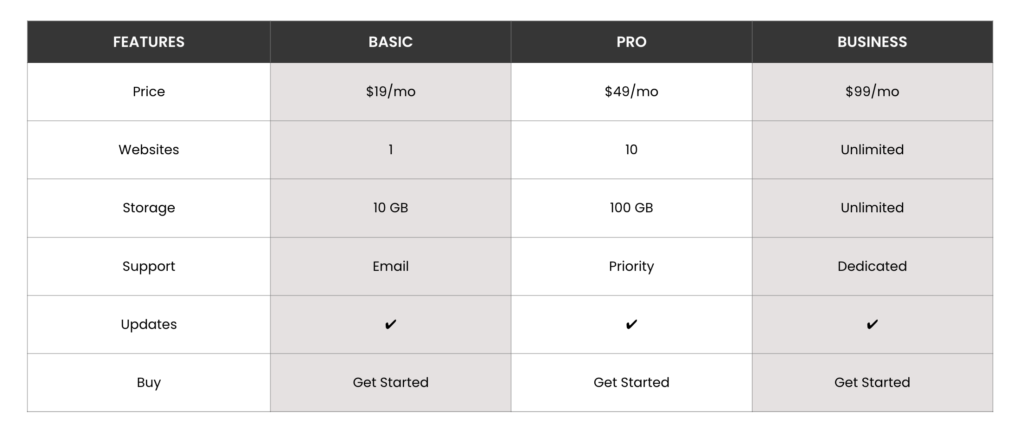
By the end of this tutorial, you’ll know how to build similar pricing tables and customize them to match your website.
Prerequisites
Before you begin, make sure you have the following plugins installed and activated:
How To Build a Pricing Table in Elementor
Now let’s start our tutorial!
Step 1: Enable the Content Table Element
After activating both plugins, the first step is to enable the Content Table element.
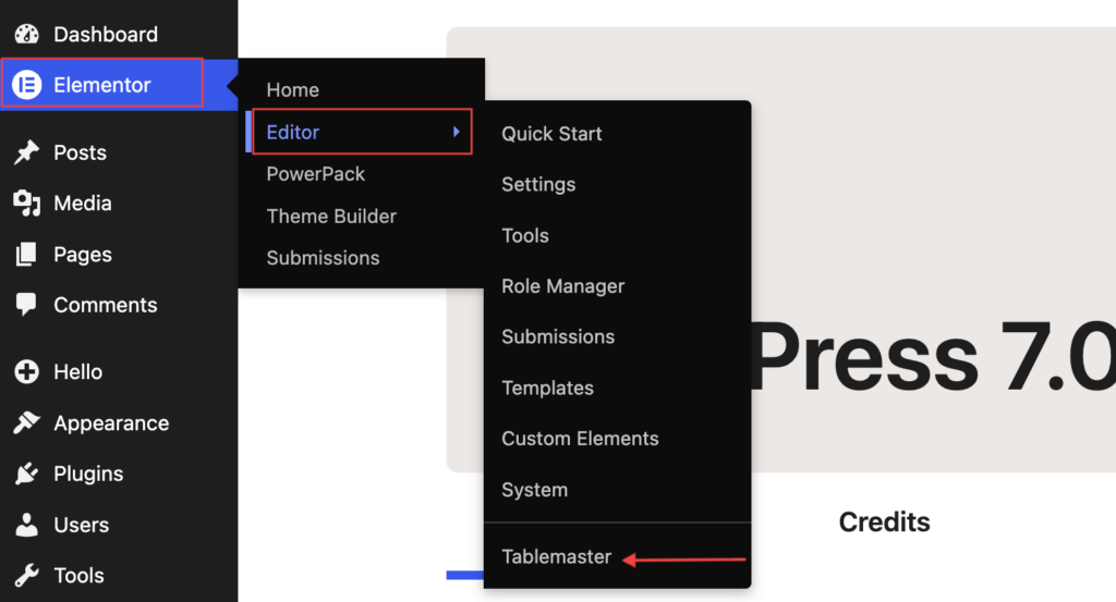
From your WordPress dashboard, navigate to Elementor >> Editor >> TableMaster.
Open the Elements tab and enable the Content Table element.
Don’t forget to click Save Changes.
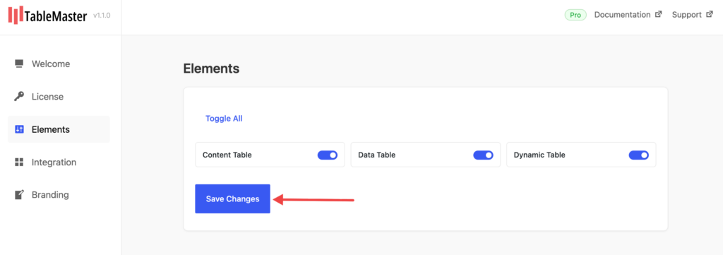
If you plan to create other types of tables later, you can also enable the Data Table and Dynamic Table elements from the same screen.
Understanding the TableMaster Elements
TableMaster includes three different table elements, each designed for a specific purpose.
Content Table
Content Table element lets you create fully custom tables by manually adding rows and columns. Use it for creating:
- Pricing tables
- Comparison tables
- Feature lists
- Specification tables
- Information tables
Since we’re creating a pricing table in this tutorial, we’ll use the Content Table element.
Data Table
Data Table element is designed to display external data inside Elementor. It’s ideal for displaying data from:
- Google Sheets
- CSV files
- JSON sources
Whenever your table data changes frequently, the Data Table element helps keep everything updated automatically.
Dynamic Table
Dynamic Table element automatically displays WordPress data in a table layout. It’s perfect for displaying:
- WordPress posts
- WooCommerce products
- Custom Post Types
- Dynamic website content
Step 2: Add the Content Table to Your Page
Now that the Content Table element is enabled, it’s time to add it to your page.
- Create a new page or edit an existing one with Elementor.
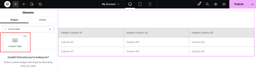
- In the Elementor widgets panel, search for “content table”.
- Drag and drop the widget onto your page.
Look for the widget with the TME badge.
Once added, you’ll see two main tabs in the Elementor panel:
- Content
- Style
We’ll first build the pricing table in the Content tab, then customize its appearance in the Style tab.
Step 3: Configure the General Settings
General section contains the basic settings that control how your pricing table behaves.
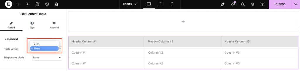
Table Layout
This option determines how column widths are calculated.
- Auto: The width of each column is automatically adjusted based on its content. This option works well when each pricing plan contains different amounts of information.
- Fixed: All columns maintain equal widths regardless of their content. For pricing tables, Fixed is generally the recommended option because it creates a cleaner and more balanced layout.
Responsive Mode
Responsive Mode controls how your pricing table appears on smaller devices. You can choose from three options:
- None: The table keeps its original layout across all screen sizes.
- Stack: Each table row stacks vertically, making the content easier to read on mobile devices.
- Scroll: A horizontal scrollbar is added, allowing visitors to scroll through the pricing table without breaking the layout.
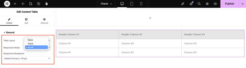
For pricing tables with multiple plans, Scroll usually provides the best user experience.
Step 4: Create the Table Header
Header section lets you create the columns of your pricing table. Each column represents a pricing plan or a category of information.
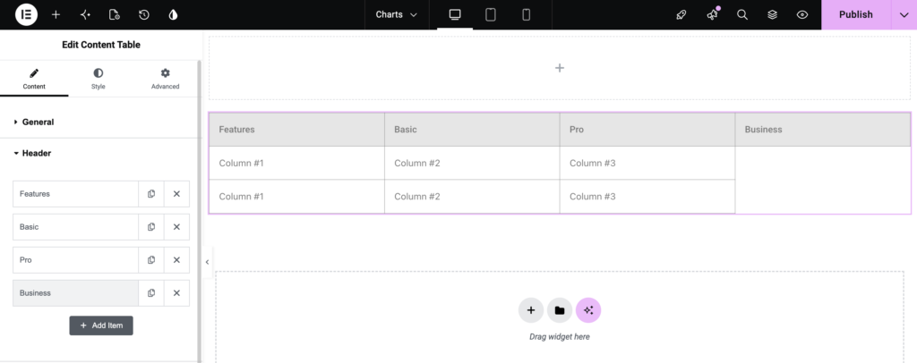
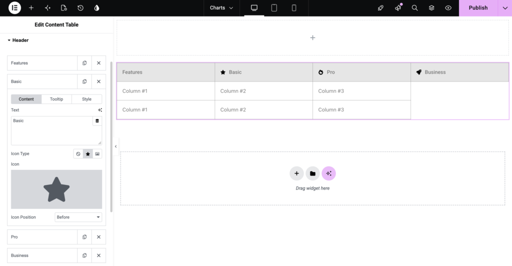
For our tutorial, we’ll create four columns: Features, Basic, Pro and Business
These headers will appear at the top of your pricing table.
Add Header Columns
By default, the Content Table includes three header columns. Since our example requires four columns, you’ll need to add one more.
- Expand the Header section.
- Edit the existing columns and rename them as: Features, Basic, Pro, Business
- Click Add Item to create another column.
- Name the new column Business.
Your header should now look similar to this:
You can also:
- Duplicate an existing column.
- Delete unnecessary columns.
- Rearrange columns using drag and drop.
Configure Individual Header Settings
Click any header column to customize its settings.
- Text: Enter the heading that will appear at the top of the column.
- Tooltip: Tooltips provide additional information when visitors hover over a header. For example:
- Basic: Ideal for individuals
- Pro: Best for growing businesses
- Business: Perfect for large teams
Adding tooltips helps visitors understand the purpose of each pricing plan without adding extra text inside the table.
- Style: Use the Style option to customize the appearance of individual headers whenever needed.
- Icon Type: You can display an icon or image alongside the header text. Available options include: None, Icon, or Image. You can:
- Add a ⭐ icon to the Pro plan to highlight it.
- Display a 🔥 icon for your most popular plan.
- Use a company logo or plan icon for branding.
Step 5: Add the Pricing Table Content
Once the headers are ready, it’s time to add the actual pricing information. The Body section is where you’ll create rows and fill each cell with your pricing details.
For this tutorial, we’ll create the following pricing table.
Understanding Rows and Cells
Body section uses a repeater interface, making it easy to build tables. It consists of two components:
- Table Row: Represents an entire row.
- Table Cell: Represents an individual cell inside that row.
When you click Add Item, you can choose to add either a new row or a new cell. You can also:
- Duplicate rows or cells.
- Delete unwanted rows.
- Rearrange rows and cells using drag-and-drop.
Note: Always ensure each row has the same number of cells as the header columns. This keeps the table properly aligned.
Create the First Row
Let’s begin by adding the pricing information. Create a new row and enter the following values:
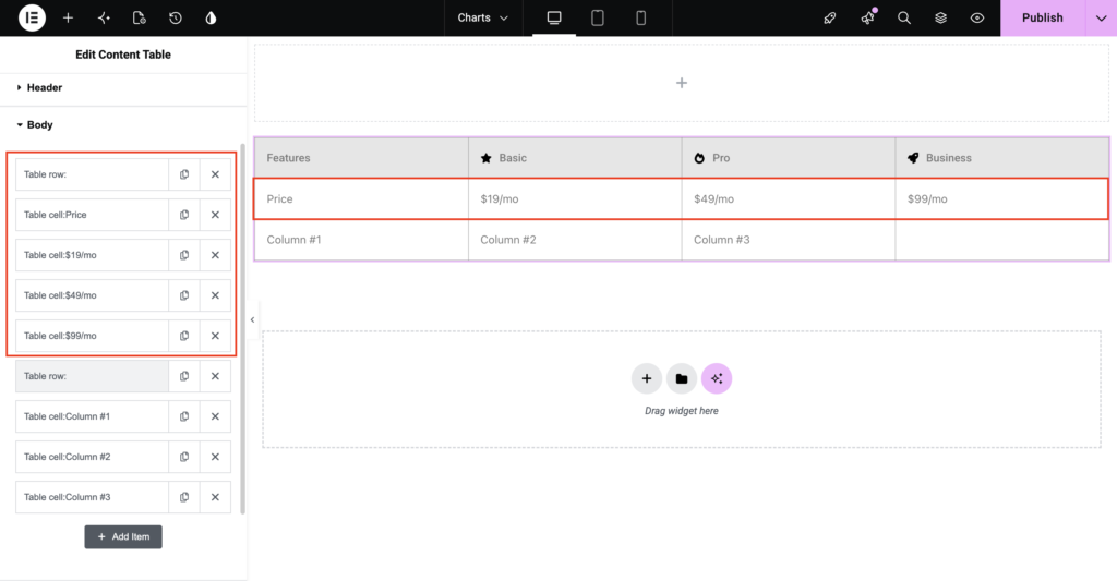
Repeat the same process to add additional rows.
Add the Remaining Rows
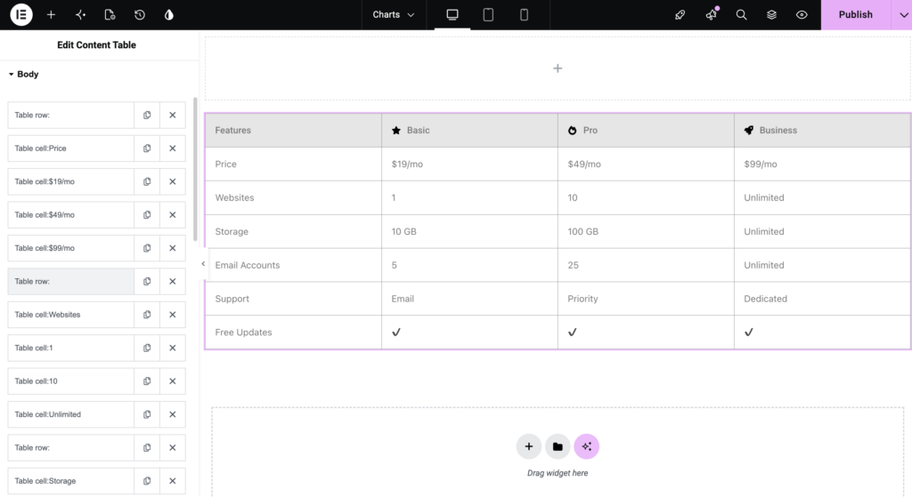
Finally, create one more row for the call-to-action buttons.
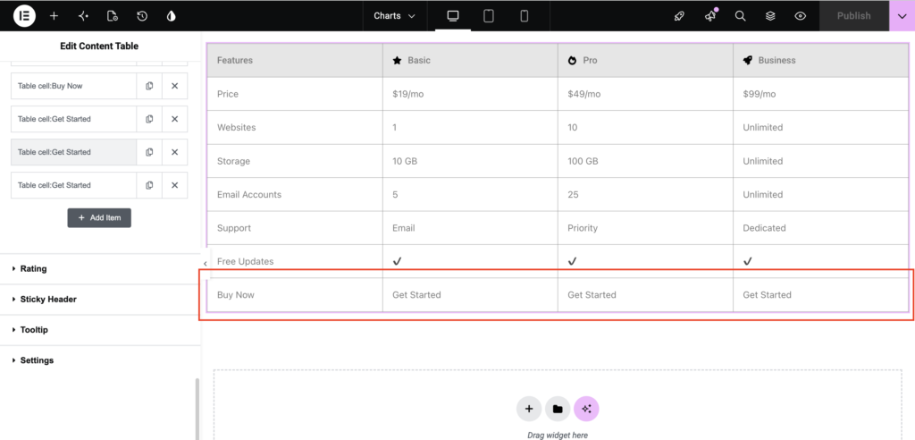
At this stage, your pricing table structure is complete.
Customize Individual Table Cells
Click any table cell to open its settings.
Label: The Label helps you identify a cell while editing the table in Elementor. This label is visible only inside the editor and does not appear on the front end.
Content: The Content tab lets you add and format the information displayed inside each cell. You can enter:
- Plain text
- Bold and italic text
- Lists
- Links
- Images
- Custom HTML
- Rich text using the Elementor editor
For example:
- Display $49/month in bold to make the pricing stand out.
- Highlight Unlimited features using bold formatting.
- Add line breaks to improve readability.
Tooltip: Use the Tooltip tab to display additional information when users hover over a cell. For example, you can add tooltips like:
- Unlimited: No usage restrictions.
- Priority Support: Response within 24 hours.
- Dedicated Support: Personal account manager included.
Style: The Style tab lets you customize the appearance of individual cells. You can:
- Highlight the Pro plan.
- Apply a different background color to featured plans.
- Change text colors.
- Adjust typography.
- Modify borders and spacing.
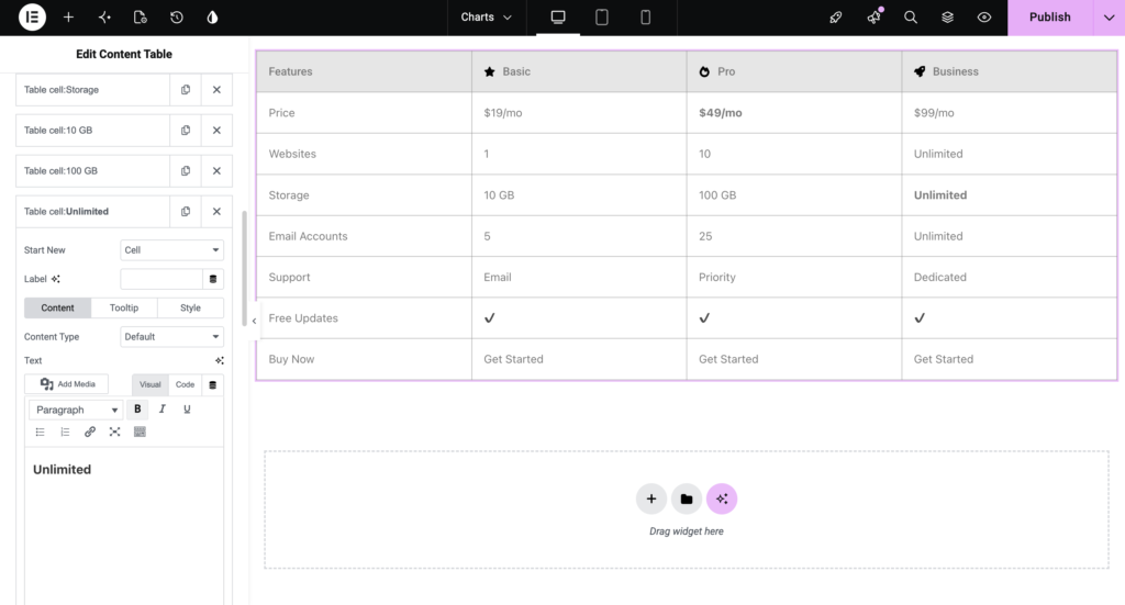
Your pricing table is now fully structured and contains all the essential information. Next, we’ll explore additional features like Ratings, Sticky Header, Tooltips, and Advanced Table Settings, followed by styling the table to match your website.
Step 6: Add Advanced Table Features
Note: The Rating section is available in the Pro version of TableMaster.
To display ratings in your table, first create an additional row and add the required columns based on your table content. Then, set the Content Type to Rating for the cells where you want to display the ratings.
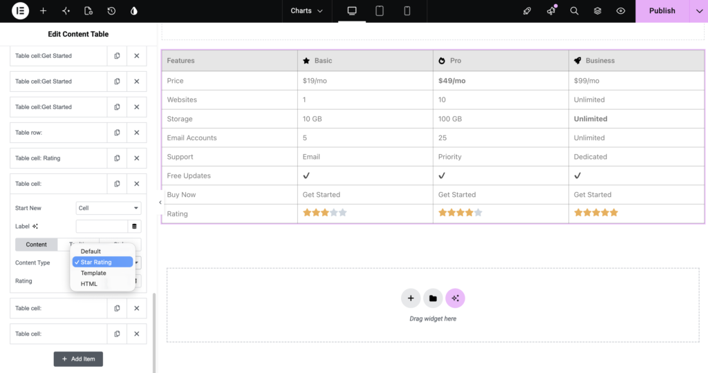
Rating feature allows you to display visual ratings within your table. Although it’s commonly used for product reviews and comparison tables, it can also be useful in pricing tables to highlight the overall value of each plan.
For example, you can assign ratings like this:
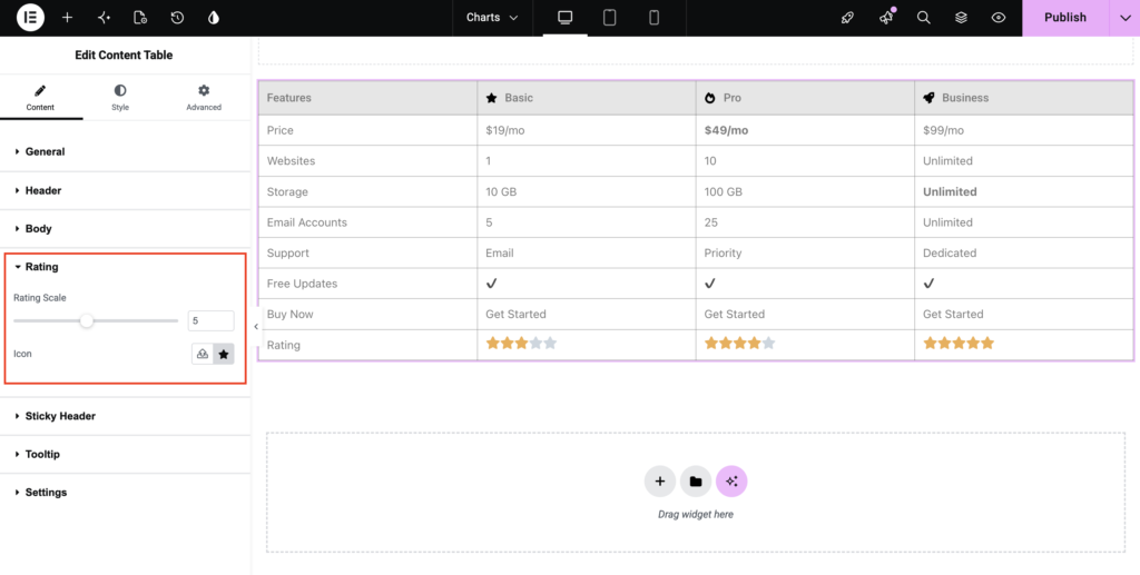
Available Settings
Rating Scale: Choose the highest rating. If you set the scale to 5, users can display ratings from 1 to 5 stars.
Icon: Choose the icon used for the rating. Although stars are the most common choice, you can select any icon that matches your website’s design.
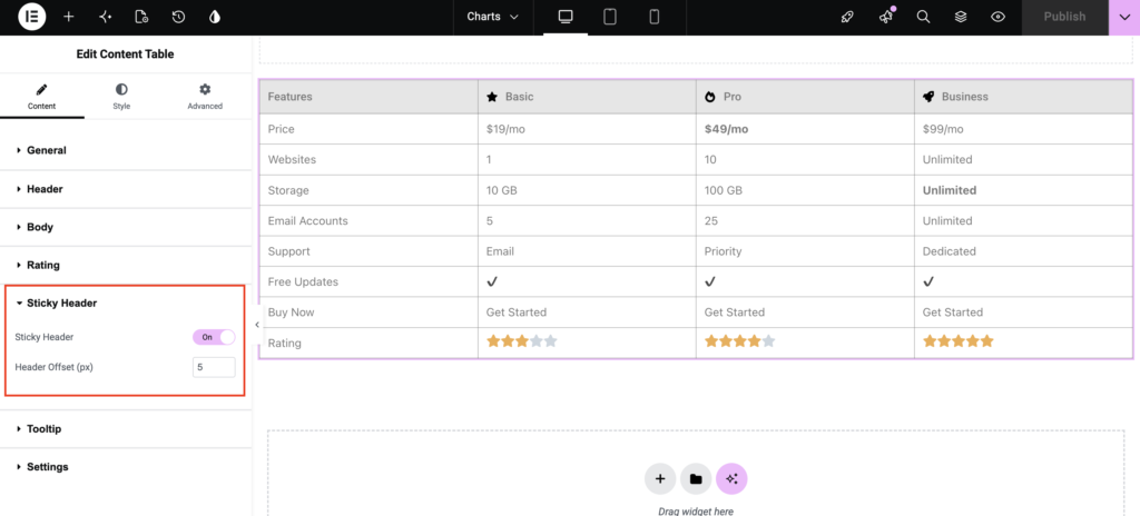
Sticky Header
If your pricing table contains many rows, visitors may lose track of which column corresponds to which pricing plan as they scroll.
The Sticky Header feature solves this problem by keeping the header visible as users scroll through the table.
- Enable Sticky Header: Turn on the Sticky Header option to keep the column headings fixed at the top of the page as you scroll. This makes large pricing and comparison tables much easier to navigate.
- Header Offset: Use the Header Offset option to control the distance between the sticky header and the top of the browser window. This setting is especially useful if your website already has a fixed navigation menu.
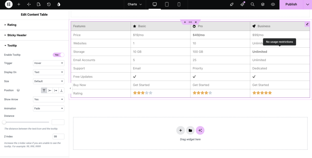
Tooltip Settings
Earlier in this guide, we added tooltips to individual headers and cells. The Tooltip section lets you control how tooltips behave throughout the table.
- Enable Tooltip: Enable this option to activate tooltip functionality throughout your pricing table.
- Trigger: Choose how visitors can view the tooltip. Depending on your preference, tooltips can appear when users hover over or interact with an element.
- Display On: Select where tooltips should be displayed within your table.
- Size: Choose the tooltip’s overall size.
- Position: Control where the tooltip appears relative to the selected element. You can display it: Above, Below, Left, or Right
- Show Arrow: Enable this option to display an arrow pointing toward the related content.
- Animation: Choose an animation effect for displaying tooltips. Subtle animations help create a smoother user experience without being distracting.
- Distance: Adjust the spacing between the tooltip and its associated element. Increasing this value creates more separation between the tooltip and the text or icon.
- Z-Index: If your tooltip appears behind other page elements, increase the Z-Index value to ensure it stays visible.
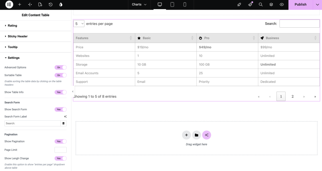
Settings
The Settings section provides additional features that improve how visitors interact with your table. Enable Advanced Options to access these settings.
Sortable Table
Enable Sortable Table if you want visitors to sort table data by clicking the column headers. For pricing tables, this feature is generally optional. However, it can be useful when displaying large comparison tables with multiple plans or features.
Show Table Info
Enable this option to display information about the number of entries currently visible in the table. This feature is more useful for large data tables than standard pricing tables.
Search Form
If your pricing table includes many plans or features, adding a search box can help visitors quickly find what they’re looking for.
Show Search Form
Enable this option to display a search field above the table. Visitors can instantly filter table content by entering keywords.
Search Form Label
Customize the text displayed next to the search field, such as: Search Plans, Search Features & Find a Plan
Pagination
Pagination divides large tables into multiple pages, improving readability and reducing scrolling. Although most pricing tables fit on a single page, pagination can be useful for extensive feature comparison tables.
Show Pagination
Enable this option to display pagination controls below the table.
Page Limit
Specify how many rows should appear on each page.
Show Length Change
Enable this option to display an Entries Per Page dropdown, allowing visitors to control how many rows are visible.
Your Pricing Table Is Ready
At this stage, your pricing table is fully functional. It now includes:
- A structured layout
- Pricing plans
- Feature comparisons
- Call-to-action buttons
- Responsive behavior
- Interactive tooltips
- Sticky headers (optional)
- Advanced table functionality
The final step is to customize your table’s appearance using the Style tab to match the design of your Elementor website.
Step 7: Style Your Pricing Table
Once you’ve finished building your pricing table, switch to the Style tab to customize its appearance.
Style tab gives you complete control over the table’s design, helping you create a pricing table that blends seamlessly with your website.
It includes the following styling sections:
- Table
- Header
- Rows
- Cells
- Icon
- Button
In the next section, we’ll explore each of these styling options and see how you can create a visually appealing pricing table that encourages visitors to take action.
Table
Table section controls the overall appearance of your pricing table. From here, you can customize:
- Width: Adjust the table width to fit your page layout. You can make the table span the full width of its container or reduce its width for a more compact design.
- Alignment: Choose how the table is aligned within its container. Available options include: Left, Center or Right
- Background Type: Add a background color or gradient to your table to make it stand out. You can use a light background color to separate the pricing table from the rest of your page.
- Border Type: Add borders around the table and customize their style, width, and color. Borders help define each pricing plan and improve readability.
- Box Shadow: Apply a box shadow to add depth and make your pricing table more visually prominent.
- Border Collapse: Choose how adjacent table borders should behave. This setting lets you create either a seamless table design or a layout with clearly separated cells.
Header
Header section controls the appearance of your column headings. Here, you can customize:
- Typography
- Text Color
- Background Color
- Sortable Icon Color
- Border
- Horizontal Alignment
- Vertical Alignment
- Padding
You can also configure separate styles for the Normal and Hover states.
To make your table header more eye-catching and interactive, you can:
- Use a bold font for plan names.
- Apply a contrasting background color to the header.
- Highlight the Pro plan using a different text or background color.
Rows
Rows section lets you customize the appearance of every row in the table.
Alternate Rows
Enable Alternate Rows to apply different background colors to consecutive rows. This improves readability, especially when your pricing table contains many features.
Normal and Hover States
Customize both the Normal and Hover states for table rows. You can modify: Text Color & Background Color
Adding a hover effect provides visual feedback when users hover over the table.
Cells
The Cells section controls the design of individual table cells. Available styling options include: Typography, Text Color, Background Color, Border, Horizontal Alignment, Vertical Alignment & Padding
These settings help improve the readability of your pricing information.
You can:
- Increase the font size of the pricing values.
- Use bold typography for important features.
- Center-align all pricing details for a clean and consistent layout.
- Add padding to increase the spacing between the content and the cell borders.
Icon
If you’ve added icons or images to your pricing table, the Icon section lets you customize their appearance.
- Icon Settings: Customize, Color, Size & Spacing. You can display green check icons for included features or red cross icons for unavailable features.
- Image Settings: If you’re using images instead of icons, you can adjust: Image Radius & Border Radius
Button
The Button section lets you customize the call-to-action buttons in your pricing table. You can modify: Typography, Text Color, Background Color, Border, Border Radius, Padding & Box Shadow
Separate styling controls are available for both the Normal and Hover states.
Note: All styling options follow Elementor’s standard interface, making them easy to customize. Simply adjust the controls while viewing the live preview to see your changes instantly.
Final Result: Pricing Table in Elementor
Congratulations! You’ve successfully created a fully responsive pricing table in Elementor using the Content Table element from TableMaster.
Your table now includes:
- Multiple pricing plans
- Feature comparisons
- Call-to-action buttons
- Responsive layout
- Optional tooltips and sticky headers
- A fully customizable design that matches your website
Since the Content Table element offers complete flexibility, you can easily adapt the same workflow to create comparison tables, feature matrices, specification tables, and other custom layouts.
Wrapping Up!
Building a professional pricing table in Elementor doesn’t have to be complicated. With the Content Table element in TableMaster, you can create responsive, feature-rich pricing tables without writing a single line of code.
From adding pricing plans and feature comparisons to customizing colors, typography, icons, and buttons, every part of your table can be tailored to match your brand and improve the user experience.
Experiment with different layouts, highlight your most popular plan, and use Elementor’s styling options to create a pricing table that looks great and helps visitors make confident purchasing decisions.
